UI Components
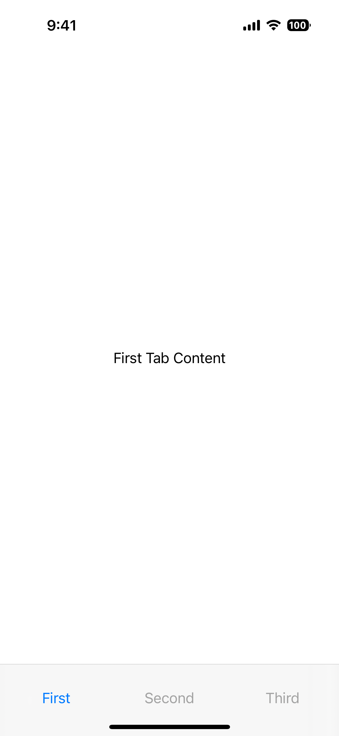
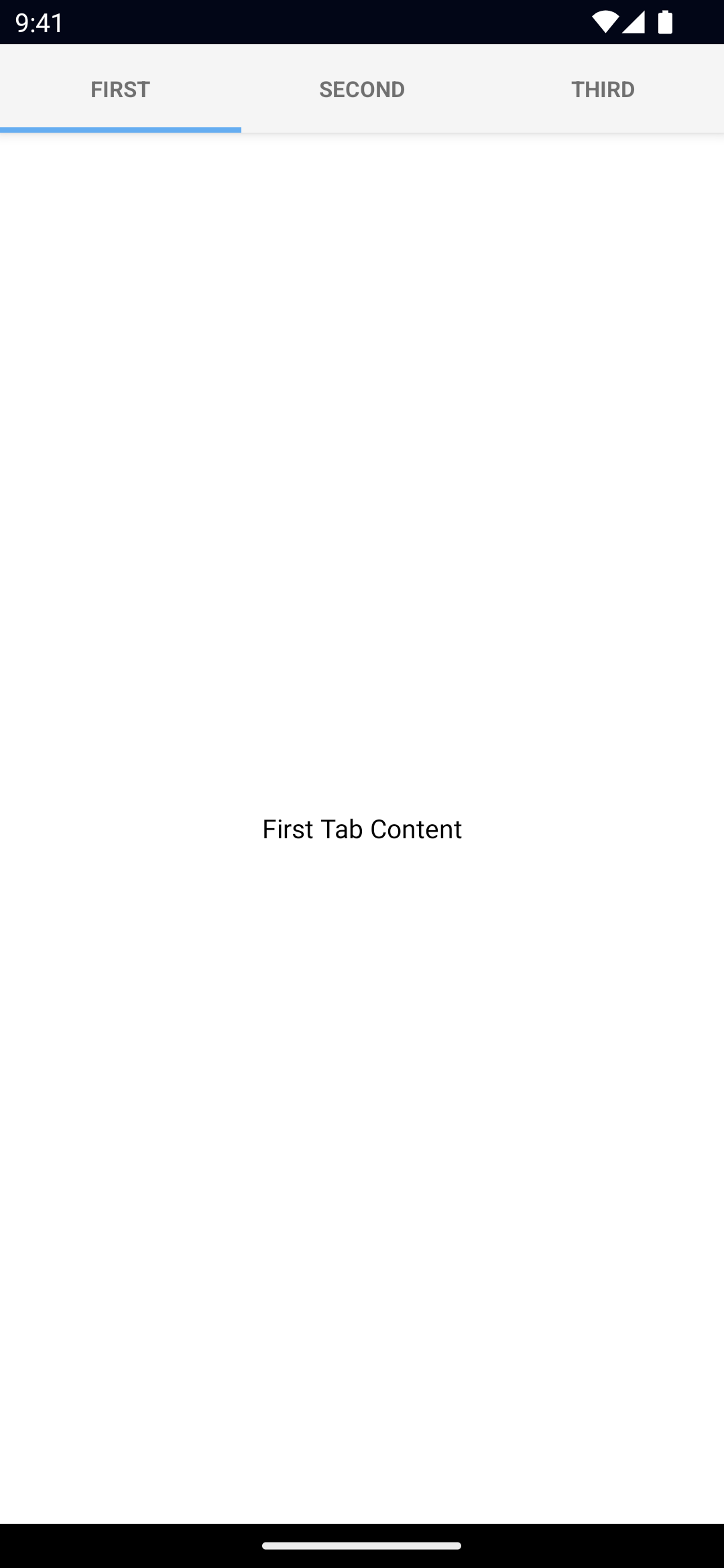
TabView
UI component for grouping content into tabs and letting users switch between them.
<TabView> is a UI component that shows content grouped into tabs and lets users switch between them.
As of NativeScript 9, on iOS 26+, TabView now supports:
- an optional bottom accessory view (
iosBottomAccessory) that sits just above the tab bar and participates in layout, and - a configurable tab bar minimize behavior (
iosTabBarMinimizeBehavior) so you can control how/when the tab bar hides when scrolling.
Props
selectedIndex
selectedIndex: numberGets or sets the currently selected tab.
Defaults to 0.
tabTextColor
tabTextColor: ColorGets or sets the text color of the tab titles.
Corresponding CSS property:
.tab-view {
  tab-text-color: #fff;
}
See Color.
tabTextFontSize
tabTextFontSize: numberGets or sets the font size of the tab titles.
Corresponding CSS property:
.tab-view {
  tab-text-font-size: 24;
}
tabBackgroundColor
tabBackgroundColor: ColorSets the background color of the tabs.
Corresponding CSS property:
.tab-view {
  tab-background-color: #3d5a80;
}
See Color.
androidSelectedTabHighlightColor
androidSelectedTabHighlightColor: ColorSets the underline color of the tabs. Android only.
Corresponding CSS property:
.tab-view {
   android-selected-tab-highlight-color: #3d5a80;
}
See Color.
androidTabsPosition
androidTabsPosition: 'top' | 'bottom'Sets the position of the tabs. Android only.
Defaults to top.
iosIconRenderingMode
iosIconRenderingMode: 'automatic' | 'alwaysOriginal' | 'alwaysTemplate'Gets or sets the icon rendering mode on iOS. iOS only.
Defaults to automatic.
iosBottomAccessory
iosBottomAccessory: View // iOS 26+ onlyAssigns a bottom accessory view that is rendered above the iOS tab bar, inside the TabView's layout. This is useful for mini players, status bars, or context-sensitive actions that should stay attached to the tab bar. On platforms below iOS 26 this property is ignored.
Notes:
- Give it an explicit
heightor style it with CSS so the TabView can measure it. - It participates in layout pass fixes added in this release so it will resize alongside safe areas.
- On Android this is ignored.
iosTabBarMinimizeBehavior
iosTabBarMinimizeBehavior:
  | 'automatic'
  | 'never'
  | 'onScrollDown'
  | 'onScrollUp'
Controls how the iOS tab bar minimizes/hides in response to scrolling. This mirrors the iOS 26 tab bar behavior on UITabBarController.
automatic– system chooses; good default.never– keep the tab bar always visible.onScrollDown– hide the tab bar when scrolling down.onScrollUp– show the tab bar when scrolling up.
Ignored on iOS < 26 and on Android.
...Inherited
For additional inherited properties, refer to the API Reference.
TabViewItem Props
title
title: stringGets or sets the title of the tab strip entry.
textTransform
textTransform: TextTransformType // "initial" | "none" | "capitalize" | "uppercase" | "lowercase"Gets or sets the text transform.
See TextTransformType.
Defaults to initial.
iconSource
iconSource: stringGets or sets the icon source of the tab strip entry.
Supported paths are font://, res://, sys:// (iOS only), or an absolute path (eg. ~/assets/image.png).
See Image for details on the different paths.
Events
selectedIndexChange
on('selectedIndexChanged', (args: EventData) => {
  const tabView = args.object as TabView
  console.log('TabView selectedIndex:', tabView.selectedIndex)
})
Emitted when the selected tab changes.
Platform specific notes
iOS 26+ bottom accessory
On iOS 26+ you can attach any NativeScript view as a bottom accessory, such as a mini player, quick actions, or a context bar. On earlier iOS versions and on Android this is ignored safely.
<TabView
  id="mainTabs"
  selectedIndex="0"
  iosTabBarMinimizeBehavior="automatic"
  iosBottomAccessory="
    <StackLayout
      height='44'
      backgroundColor='#1c1c1e'
      orientation='horizontal'
      horizontalAlignment='stretch'>
      <Label text='Now playing…' color='white' verticalAlignment='center' marginLeft='12' />
    </StackLayout>
    ">
  <TabViewItem title="Library">
    <Label text="Your library" />
  </TabViewItem>
  <TabViewItem title="Search">
    <Label text="Search" />
  </TabViewItem>
</TabView>
You can also set the accessory from code if you need to build it dynamically:
const tabView = page.getViewById('mainTabs') as TabView
const accessory = new StackLayout()
accessory.height = 44
accessory.backgroundColor = '#1c1c1e'
tabView.iosBottomAccessory = accessory
Native component
- Android:
androidx.viewpager.widget.ViewPager - iOS:
UITabBarController
Contributors


